Turning COVID-19 into a data visualization exercise for your students
This post originally appeared on SAGE Ocean
We will emerge from this pandemic with a better understanding of the world and an improved ability to teach others about it. For now, we need to be continuously analyzing the data and thinking about the lessons we can learn and apply. Here’s how you can join in!
At SAGE, we have been working with academics around improving and sharing teaching resources, especially for quantitative and computational methods in social sciences. Besides the mass remote and emergency teaching experiment happening right now, one of the positive things we can already identify and reuse to improve learning in methods courses is the glut of data visualizations. The absolute advantage here is that all these visualizations are produced (almost always) with the same raw input, telling a variety of different stories. What better way to explain the different uses and impact of visualizations and the use of different tools to students than examples based on the same data?
For this blog, we thought we would make a start collating the variety of plots and multi-panels grouped based on the tools and skills required to create them. We’ve also included further resources for the type of visuals we discuss or introductory materials around the tools used to create them. We hope these will be useful for teachers and students who want to learn more or use different visualization examples in their methods courses.
1. Mapping the raw numbers to follow live data
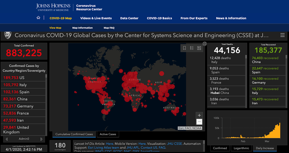
While it’s an impressive effort to pull together live data from various sources, and the dashboard makes it almost effortless to follow the spread of the virus based on the reported numbers of infected people across the world, it is only that. It is not easy to draw many conclusions from these types of dashboards, and the red bubbles across the world could be visually misleading, especially when areas are more densely populated and so larger absolute numbers might convey wider spread, when in fact it’s inaccurate. This is pretty much like harvesting the wheat and selling it by the ton. You’ve got the wheat grains out of the field and into the barn, which you know is useful, but there isn’t much you can do with it if you don’t have a mill and some knowledge around making the flour and potentially yeast for something more easily consumable, like bread.
Pros: Interactive, can be live, multi-panel, high-level view of the raw figures.
Cons: More useful when scaled to location or in this case the population; requires standard reporting across all geo locations otherwise hard to visualize missing data.
Live map: here.
Data available in this GitHub repository.
Cite as: Dong E, Du H, Gardner L. An interactive web-based dashboard to track COVID-19 in real-time. Lancet Infect Dis; published online Feb 19. https://doi.org/10.1016/S1473-3099(20)30120-1.
Resources:
-
Going one step further and making your dashboard a bit more useful from information is beautiful, and with many more details from Max Roser and team as we are learning the best ways to convey live data to an increasingly more worried world.
-
Noting that these numbers are based on positive tests, and different countries ramped up or de-escalated testing differently, this FiveThirtyEight article estimates various scenarios.
-
Similar dashboards can be created with Tableau Public.
-
Other dashboards and panels that you could easily create without advanced coding skills with Datawrapper (including the famous cumulative cases by country from first known patients).
-
Learn ArcGIS and notes on mapping covid-19 with ArcGIS.
2. Using R and Shiny to interact with the visualizations
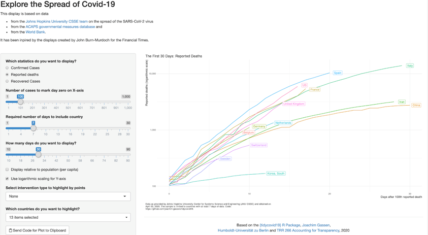
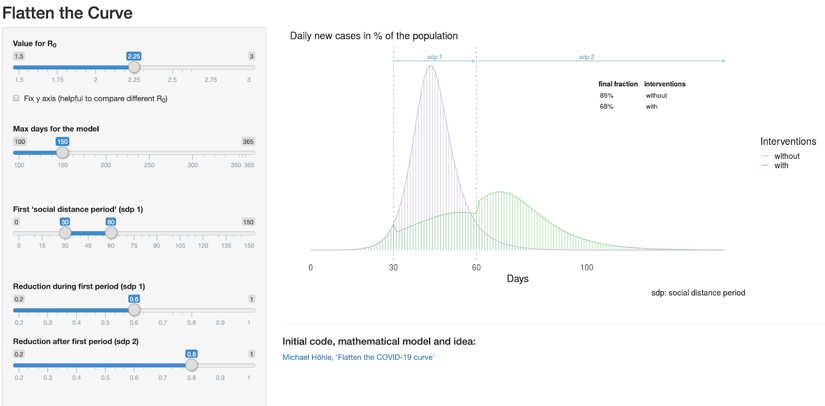
The beauty of using R and being really proficient with it is that you can quickly put together an interactive web interface for others to play with. This can be done with the open-source R package — Shiny. For example, the most popular shared graphs in the news have been the ones around flattening the curve and aligning the trajectories of the virus spreading by country. But as you will know, the visualization can be sensationalized when different defaults are set. With this Shiny app from Joachim Gassen, you can move the dials and choose the variables to be displayed. Similarly, with this other Shiny app from Tinu Schneider, you can adjust the defaults and see how the curve could flatten.
Going one step further, you can also use Shiny to create interactive simulations, like this one from Alison Hill, a research fellow at Harvard, looking at the spread and the healthcare capacity. She also included a useful tutorial.
Pros: Open-source, can be replicated, interactive, can adjust the defaults
Cons: Requires some coding experience in R
Data and associated code available here for the trajectories by country, here for flattening the curve, and here for the hospital capacity simulations.
Resources:
-
RStudio blog on using R, tidyverse packages and RECON libraries to compile and visualize covid19 data.
-
Maja Zaloznik’s Intro to R. Access the slides or watch the webinar.
-
The Carpentries’ R for Social Scientists training, which includes data viz with ggplot.
-
A train-the-trainer session on how to teach Shiny from RStudio.
-
More examples of visualizations in R from RStudio and Rittman Mead, and a primer on data visualization also from RStudio.
-
Improve your data visualizations with more recipes and loads of examples from this R Graphics Cookbook.
-
Full course materials using R: Modeling Criminological Data from the University of Manchester or this workshop on Getting Started with R from Réka Solymosi, Henry Partridge and Sam Langton.
3. Using python with matplotlib to visualize tweets
Yes, these graphs require much more work and a team of about nine researchers to collect the data, conduct analyses and visualize it properly. The Computational Story Lab at University of Vermont collected tweets in more than 20 languages related to COVID-19 and used a variety of tools to get to these visualizations: unix, matplotlib, mongodb, gitlab, and ‘an exceedingly small batch of artisanal matlab by the artist Peter Sheridan Dodds’, @peterdodds (according to Chris Danford). The easy to digest summary here, and full paper with code on gitlab.
Pros: Can do advanced and multi-panel visualizations.
Cons: You need the skills to use these tools.
Data available in gitlab.
Cite as: Alshaabi, T., Minot, J.R., Arnold, M.V., Adams, J.L., Dewhurst, D.R., Reagan, A.J., Muhamad, R., Danforth, C.M., & Dodds, P.S. (2020). How the world’s collective attention is being paid to a pandemic: COVID-19 related 1-gram time series for 24 languages on Twitter. https://arxiv.org/abs/2003.12614.
Resources:
-
How to use python to gather COVID-19 data.
-
SAGE Campus: Introduction to Python for social scientists.
-
Phillip Brooker’s Programming with Python for Social Science.
-
All types of charts with Python explained.
-
100 tips and tricks for working with pandas from Data School.
-
Simple ways to improve your matplotlib from Kimberly Fessel.
-
Visualizing with matplotlib excerpt and code from O’Reilly Python Data Science Handbook by Jake VanderPlas.
4. Visualizing predictions and simulations (advanced)
This requires a whole other post, but I wanted to mention a few examples we came across that sparked our attention and that we thought could be a good way to entice anyone to learn advanced simulation methods:
-
Going deep with the Bayesian scientist extracting patterns from real and synthetic models.
-
On flattening the curve, this plot is interactive, using RK4 for analysis and built with Svelte.
More resources:
Before you build another graph, especially for an ongoing event, where communication of risk and uncertainty is critical to saving lives, we definitely recommend considering some data visualization basics, for example:
-
these tips from Amanda Makulec.
-
Andy Kirk’s recommendations for better data visualizations, or his brilliant chartmaker for picking the right tool.
-
Visualizations can illuminate, but they can also be misleading. A discussion on visualizing uncertainty across all COVID-19 charts.
A final point on data visualizations from our friends at ADDTWO: although seems trivial, the main thing students struggle with is the last step - making their graph look ‘polished’! Why is this so hard? While accurate representations are critical and even when many are able to pick the right chart types, data visualizations are stories, and the design and the use of colors and sizes on graphs is similarly important. Sometimes, the tools you use are either limited or not as user friendly on the design-and-polish steps. The team at ADDTWO recommends exporting (whenever possible) your visuals as .svg and further sharpening the design with any illustrator apps (Adobe Illustrator, figma and others).
Which other data visualization examples you will be using for your next workshop or module? What are your top tips?